The art of typography: A practical guide to choosing the right fonts
In the vast landscape of design, typography is much more than just an aesthetic choice. It is the visual language that communicates with the viewer, expressing not only the message, but also the emotion and personality of a brand.
Before diving into the font selection process, it’s essential to understand the basic principles of typography. Typography encompasses elements such as type size, spacing, weight and style, and each of these elements can have a significant impact on the legibility and aesthetics of a design. In this practical guide, we’ll look at the fundamentals of typography and give you tips on choosing the right fonts for your projects.
1. Knowing Font Categories
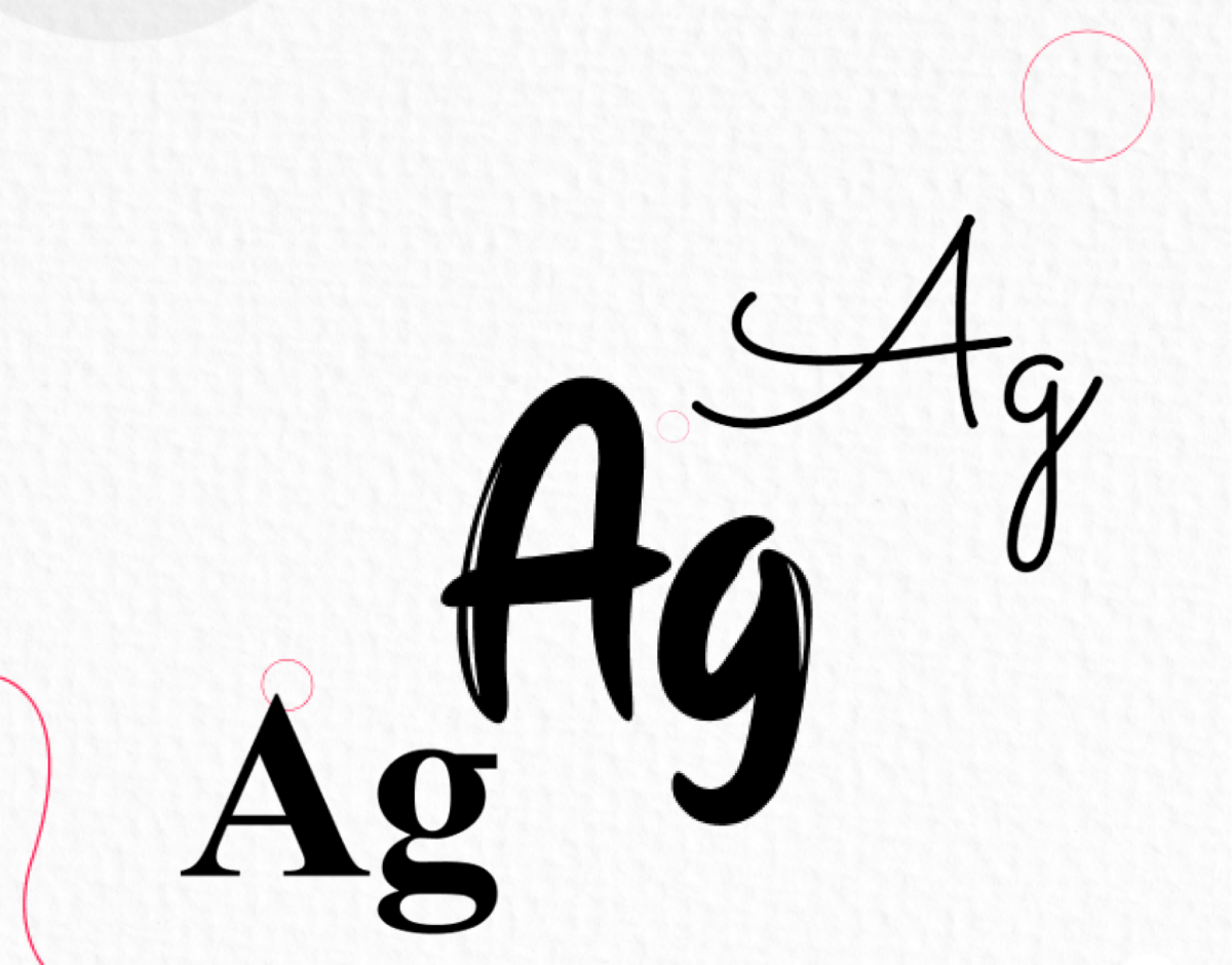
There are different categories of typefaces, including serif, sans-serif, script, decorative, and monospaced fonts. Each category has its own aesthetic and functional characteristics, so it’s important to choose the one that best suits your project.
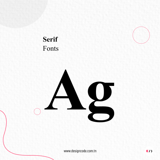
Serif Fonts
Serif fonts, with their distinctive small strokes at the ends of characters, are commonly perceived as classic and elegant, making them a traditional choice for body text in print media. Their association with tradition, elegance, and reliability makes them popular among lawyers, legal firms, and financial institutions, sectors where these values are often prized. Additionally, serif fonts offer optimal readability for long blocks of text, making them ideal for books, magazines, and publications, where text clarity is essential, particularly in the publishing and press sectors.
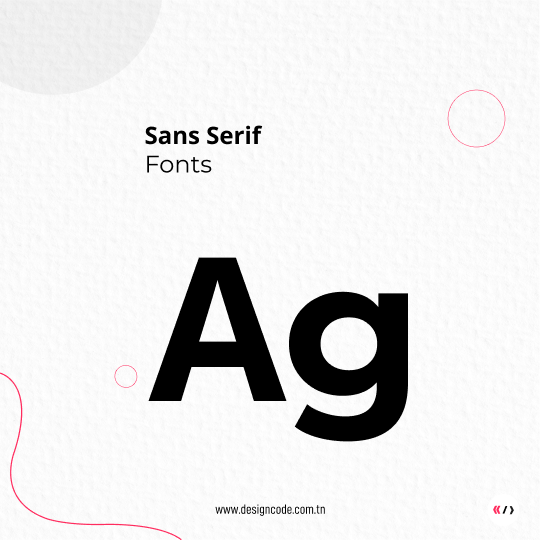
Sans-serif Fonts
Sans-serif fonts have a modern and clean appearance, lacking the small strokes (serifs) at the ends of characters, making them ideal for use on digital screens as well as for headlines. They are particularly well-suited for technology and innovation-oriented businesses, where their contemporary look aligns perfectly with the image of these constantly evolving sectors. Similarly, in the fields of design, fashion, and creativity, sans-serif fonts bring a touch of modernity and style highly appreciated, making them popular for brands and artistic and creative projects.
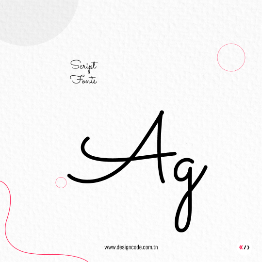
Script Fonts
Script fonts mimic elegant handwriting, making them a romantic and sophisticated choice for invitations and special events such as weddings. Their touch of personality and elegance also makes them perfect for the beauty, fashion, and luxury sectors, where they are often used for decorative elements or logos, adding a dimension of refinement and distinction to upscale brands.
Decorative Fonts
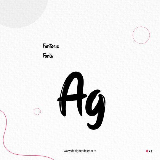
Decorative fonts feature unique and creative styles, typically reserved for specific and expressive uses. Their playful and creative nature makes them ideal for brands targeting a young and dynamic audience, especially in the fields of children’s products, entertainment, and creativity. Additionally, they bring a festive and joyful atmosphere, making them perfect for events, parties, and celebrations, adding a touch of excitement and liveliness to these special occasions.
Monospaced Fonts
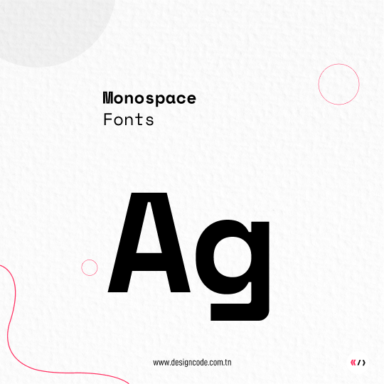
Monospaced fonts are characterized by fixed-width characters, making them ideal for displaying computer code or structured elements requiring precise presentation. Their common use in the field of computing and web development makes them a preferred choice for businesses and professionals in these sectors, where readability and clarity of code are essential for effective communication of technical information.
.
2. Harmonizing Fonts
When choosing fonts for a project, it’s essential to ensure they harmonize well together. Avoid mixing too many different fonts to avoid visually overloading your design. Prioritize one font for headlines and another for body text, ensuring they complement each other.
3. Ensuring Readability
Readability is a crucial aspect of typography. Make sure to choose fonts that are easy to read, especially for long blocks of text. Avoid overly decorative fonts for body text and prioritize fonts with good contrast between characters and the background..
4. Adapting Fonts to the Context
Consider the audience and the context in which your fonts will be used. If your project targets a professional audience, opt for simple and professional fonts. For an artistic or creative project, you can afford more original and expressive fonts.
In conclusion, the appropriate choice of fonts is crucial in building an effective brand identity. At DesignCode, we fully recognize the significant impact typography can have on the perception of a brand. We are committed to guiding our clients towards typographic choices that not only reflect their distinctive essence but also captivate the attention of their target audience. By consistently striving to provide highly personalized design advice and solutions, we aim to help our clients create strong, memorable, and authentic brands that stand out in a competitive landscape.
